URBAN CELLAR DOOR
For this project, we were asked to explore a brand within a chosen industry and how we can create a branded experience which can be beneficial to the brand and the industry. I chose a zero alcohol brand name ‘Plus & Minus’ which is a new introduction into the winery and cellar door industry. Plus & Minus presented an abundance of opportunities to explore how a brand can ensure consumer experience and satisfaction can continue during and after COVID-19.

The project was a reimagined cellar door experience placed in an urban context. This event focuses on the educational component of the ‘cellar door’ experience by tapping into the negative issues surrounding social drinking.

Plus & Minus has been chosen to explore these areas by presenting an alternative zero-alcohol drink to attendees, and how that omitting alcohol from the social setting does not prevent friends and family from having a good time.The cellar door will also provide a physical space for an e-commerce based brand, allowing brand owners to be presented with the benefits of developing a physical space for customers to experience their products.


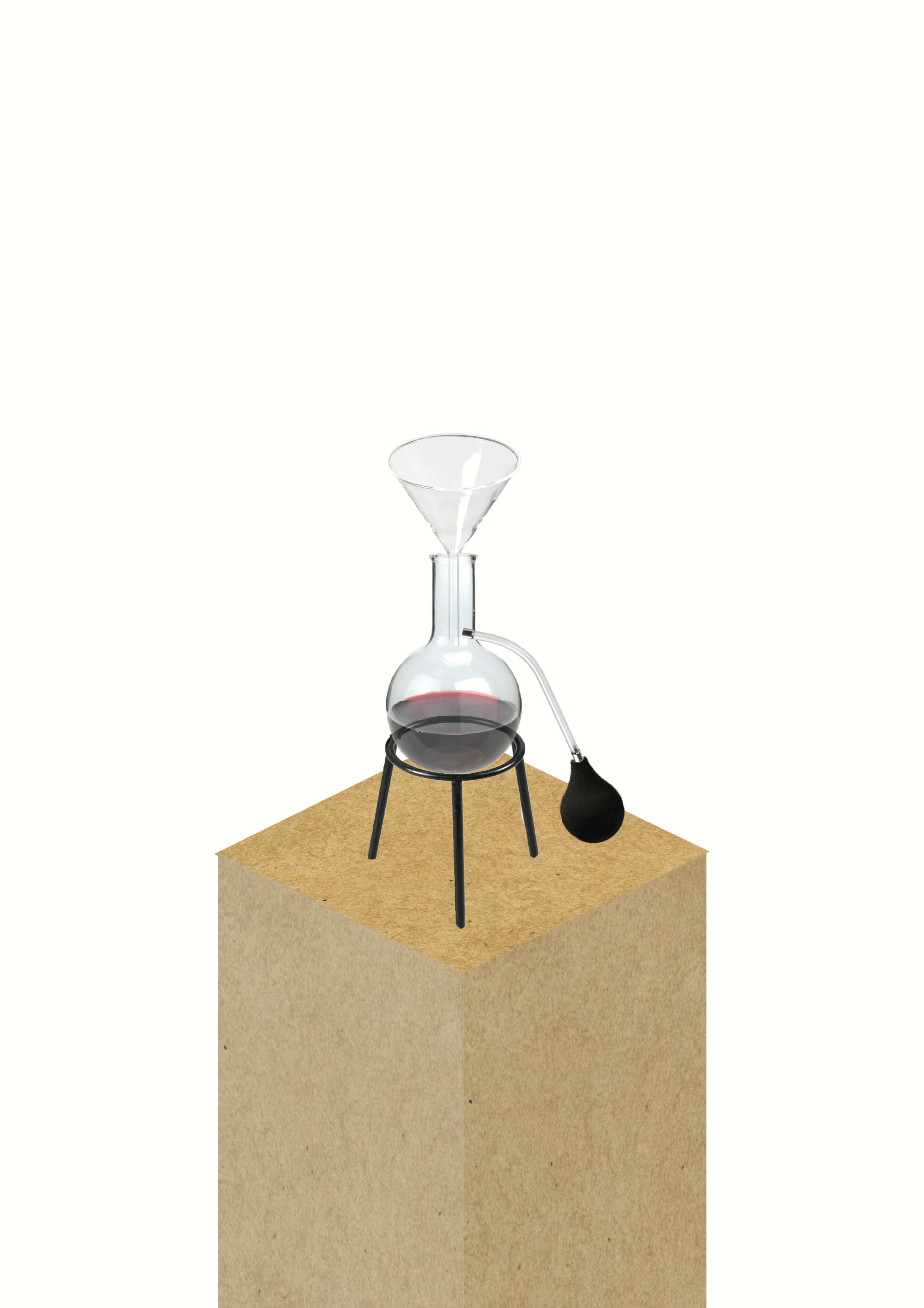
sensory experience
This was one of the sensory experiences I created for the Urban Cellar Door event. Placed within the educational zone, the activity allows for attendees to be able to smell and learn more about Plus & Minus' wine before they purchase.
As I have a love for multiple disciplines of design, I wanted to incorporate as many as I could within this project.

Poster advertisment
To allow for the optimal exposure for the event, I designed event posters which will be placed in high traffic areas within Fitzroy and the CBD of Melbourne. From a business and marketing stand point, poster advertisment is such a simple yet effect tool to spread awareness of an event. I decided to continue the brands black and white colour palette into the poster, making it stand out with the bold black background.
Event wine menu
For the event, I also wanted to design a wine menu list to present a tactile element which could be seen within the event space. The wine list again continues the black and white Plus & Minus brand theme throughs its colour palette, while adding in a secondary colour to add some warmth and personality to the object. The list presents the wines on offer at the event, pricing for a glass or bottle and a brief description about the wine and its origins.


Takeaway wine carry bag
As a way of continuing the marketing/exposure for the event, I have designed takeaway wine carry bags which attendees will be given upon purchase of the wine from the event. Similar to both the poster and wine list, the carry bags will adopt the black and white colour palette and present the brands logo around the bag. This will allow for more exposure and awareness to come to the event, as well as continuing the event experience after the attendees exit the doors.